Tuesday 11 September 2012

John Baskerville Typography Research

John Baskerville
Baskerville 
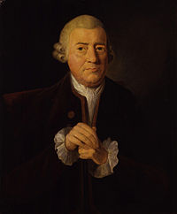
John Baskerville was a silent hero of typography and someone that was really interesting to read about. Only few who knew him and respected his work. Even though his parents were financially comfortable, however Baskerville had a true calling upon typography.

Meeting Benjamin Franklin was what really struck me, as Franklin was visiting England at the time. He was really interested to meet with John; I was amazed "Franklin was probably just as interested to meeting Baskerville". Within that meeting he also meet James Watt (1736-1819) who was the person who improved steam and also made it commercially available & Joseph Priestley (1736-1806) carried out ground breaking work on gases, and discovered oxygen. These people were all well known except from Baskerville himself, a typographer; which is a huge achievement.

He definitely has a huge history through his way up the ladder, and towards his own type face.  From his "early years "Japanning was the application of a black varnish to metal house-hold objects such as sniff boxes, buttons and candlesticks". This was later to become his greatest invention of blacker ink than anywhere and he also had "experimented with paper technology" having later "achieved an unprecedented smoothness, he  then created a gloss surface"
John Baskerville, although being financially comfortable with his inherited wealth, he still made his own mark and set out on these new experiments that has defined and shaped the world of that century. His type however didn't pick up in England, however it was considered a hit over in "Italy". Italy was the next chapter that Baskerville didn't see as he died earlier before the font had journeyed; This was then pasted on by the young Italian "Giambattista Bodoni.


Giambattista Bodoni Typography Research

Giambattista Bodoni
Bodoni


Giambattista Bodoni is a very interesting person, taking influences by John baskerville he to wanted to become a typographer. Born 1740 - 1813 he was a dedicated hard worker, from the age of 16 he worked with his father in the family business which was in printing. His dream was to eventually gather enough money to head out for England and maybe get to meet with John Baskerville. Unfortunately he contracted malaria, a couple of days before he would've set out for England. 
The Bodoni type face is very bold, also for that year it was a very modern font. There is some similarity towards Baskerville's type; there has been some vast improvements made. The b in the picture has now a tail along the baseline and everything else has been made a fraction thick in line definition.

Bodoni broke a new era of design from this, from the history of type book I found out that "he did achieve some popularity in Britain". There wasn't as much information on bodoni's carrer. However he had a goal and he saw it to the end and that was the main thing i learnt through reading pages of his life; if you set your self a goal see it through and your dream may be a reality. I like the way the flat serifs work; sort of a twist to make the old new again. As when reading text the weight us shifted to the right hand side; this would be only the capitals. I don't believe that a typeface should be remade in anyway but everything is done by influence and references; so I guess its ok. 

Paul Reener Typography Research

Paul Reener 
Futura

A German Typographer, Type designer, painter and importantly creator of the type face Futura. Reener lived in a very dark part of history yet he didn't let it get involved with his dreams of a Graphic designer. This was the period of Hitler and his powerful rein over the german army, the age of immense politics was inorder for everyone and tight measures opposed towards the public from the Adolf Hitler.

Paul was part of an article writer for "Geberauechs Graphik"; this is where he wrote up on Russian propaganda which was against the war on Germany.This was later followed up by two nazi officer which came to the Reener House asking for him " can we speak to Herr Reener" towards Reener's wife. This was all to do about his particular writing's entries that he made in the magazine. They must have been very annoyed with this article in order of soldiers to actually come out towards the house. 


The futura font is very modern for the time it was created in and was considered a blunder once it was out in the open. The people of germany used to the traditional font of "Black letter"; which looks like another version of old english. Futura was completely different, because it didn't have any serifs. The font is very clean and very light; it is a very well designed type. I especially like the way the lower case j is almost like a longer i; it completely is a well balanced design. It is a well known font and has been made digital for everyone to use in many different note/word applications. The font almost is of a standard of Helvetica in my opinion.


Herb Lubalin Typography Research


Herb Lubalin 
Lubalin Slab Serif 


Herb Lubalin Born 1918-1981 in New York, a son to a Russian father and German mother. Herb was born one of twin sons, in their family life his parents were in the orchestra ; where his mother used to sing and his father would play on the trumpet, which had musical talent on both sides of the parents. His twin brother excelled through his studies and eventually got accepted to city college, unfortunate for Herb as he "was not academically gifted". Sadly it was down to the fact of him receiving "low grades". His true calling was in order to proceed with an art study, so he later enrolled on a "free art" school; and to have great success in the future. The young Lubalin was off to a "shaky start" but he gradually moved up on the ladder and "...The end of the course he was one of the best"; this path he was taking was the start of something very new for him as he enjoyed the work of calligraphy and other methods of type design.


He began his professional career working for a small company called Sudler and Hennessy; which was after the war and drugs and medicines needed to be advertised and, Herb was in the right place at the right time. Through his years at working for the company he was promoted to being the "art director"; from that of reaching to the highest in the company that was not the end of his hopes and dreams. He left the company in 1964 in order to create his own business.

Through reading these pages, it seems that herb was a very quiet man. Also his clear devotion towards his own business of working until it was finished; I believe if you love what your working at, you will never work a day in your life, this is what I think Herb saw through as well. Im very drawn towards this artist out of them all as he has had hard ship through having a twin brother with "academically gifted" and him getting low grades; it must of made him stumble and maybe thats a suggestion that he stays quiet. Though when it comes down to the serious matter of life and his relationship with his own sons "He only exchanged a few hundred words with his father there whole life"; a man very by himself and alone.

In his work he was inspired by the late 60s work of "psychedelic and art nouveau poster lettering" It really interests me when looking at typography that stands out and having a typeface that goes in-between each other is something completely new and definitely unique towards the area of design and type to the world. It was only until 1984 ITC (was Lubalin's company name) had 50 subscribers- "almost every manufactory... in the world. He introduced a vast number of new and interesting designs of font through out his career and something that was done by his genius mind set of reference and concentration towards his goal. 

Friday 27 July 2012

Eric Gill Typography Research


Eric Gill (1882 - 1940)
The creator of Gill Sans 


The life of Eric Gill is truly amazing. Having such a huge range of talents such as becoming an Artist, Book Author, Illustrator and a Typographer. He was born of thirteen children, his father being a curator in Brighton. His morals were very strict as were his beliefs within the world he lived in. In many of his photographs he would be known to have a thick white beard which he thought was "an essential part of masculinity" and he wouldn't wear any trousers; as his morals were that it "dishonoured the male sexual organ". These were very strange to read through this book and as he is a creator of such great history there is always a story behind his unique discipline. Basically I have stumbled upon an enigma of a very intelligent and fascinated person.

Gill's san serif, is still considered to be one of the greatest creations of type in the 20th century. He did get some help in creating the font with his friend. This friend was Edward Johnston ; Eric's teacher paid close attention towards as he saw greatness and later in life he became great friends with him along his travels. 

The most influential part in the Eric Gill section is when they both are walking towards there home.
"one night after college, they were struck by the painted sans serif lettering on some tradesman's vehicle. Gill exclaimed "I wish I could do that". The way that that sentence is played out shows that he was in the stage of becoming better in what he already does; thats my way with what designer work with and to always better the first design.

Gill Sans is a very unique and modernistic piece of type a hybrid among the others that were out there in the 20th century. As being branded as one of the best fonts created ; he made a very easy and readable type by removing those serif tails on the ends, one of the very reasons to why it still gets applauded. I use this type most of the time and it shows a greatness within my own work and something that I can to aspire on though his journeys and research.

I was also amused by this later quote in the book "In 1927 Gill hand painted the shop Fascia Board for his friend Douglas Cleverdon's Antiquarian bookshop in Bristol". As living in Bristol this is a very cool eye opener that one of the greatest typographer has set foot in this city; with this in mind I have been inspired to move more into his work. Having hand painted the sign above the shop and it became very popular to the public. 

The reason I have put this picture up, is that it is hand painted not a digital piece; shows that he must of had the up most of patience and as he is a man that came back from the army "he was finally called up in August 1918 and spent a few miserable months in an army camp" he served the country and eventually came back, even more of a disciplined man. Hard work and dedication towards his work.

(http://upload.wikimedia.org/wikipedia/commons/thumb/4/47/GillFaces.png/250px-GillFaces.png)


Gill sans is used very much through out the uk, as an inheritance of our famous typographer. The font's characteristics have been used widely through different ranges of the media like for example


http://cdn.labourlist.org/wp-content/uploads/2011/11/bbc-logo.jpg
The BBC is a huge gratification towards Gill's work and his triumph through the years of his career. They had the claims towards the logo in 1997 and till this very day it is used through all of there media channels for TV and digital radio.

 We use this type through this font day in and day out, but through some of the more modern ways of living such as, using computers to type in the style of Gill sans; much more easier than to go through a process by hand. It also shows how we have lost the artistic forms of typography and this picture proves that it still is.


http://static.flickr.com/72/170900648_9581095568_o.jpg
The strokes and different measurements are very interesting to look at; it makes our generation of editing text very dull as its easy to create all on a pc or laptop with  many different publication applications. The effort and time that has gone into produce something memorable like the London underground symbol/logo is seen by busy people around London maybe not even knowing how this was made. 

http://www.google.co.uk/imgres?um=1&hl=en&biw=1600&bih=809&tbm=isch&tbnid=MZTj74SKJ7NwQM:&imgrefurl=http:/
/www.mobot.net/london-underground-wifi-service-live-42658&docid=wPysp04ah3GkMM&imgurl=http://www.mobot.net/writer/wordpress/wp-content/uploads/2012/03/london_underground_logo.jpg&w=320&h=260&ei=7HMSUNLGN6jA0QX

They have basically simplified the image completely which is always a designers principle ; removing the heavy stroke making it uncovered doesnt look as appealing towards me if I was going to have a look.

Eric Gill is a great asset towards the country as one of the best designers of Graphics. He has been a real inspiration towards my work in general. With discipline and structure of my work method Ill be on the right lines.


Saturday 21 July 2012

Summer Project


The Summer Project 
Experimentation within Typography


In prior to the completion of my 1st year, I was asked to come back into college to discuss the summer project. The task is to look in to selective font for research and experimentation. This task is essential for the course to carry on in the second year. The font list is 

Gill Sans (Sans Serif)
Futura (Sans Serif)
Lubalin (Slab Serif)
Helvetica (Sans Serif)
Template Gothic 
Bodoni (Didone)
Baskerville (Transitional Serif) 

To research these facts I have been reading a book "Type : The Secret History of letters" So far the book is listed with a number of different stories of other artists and typographers. 


"The Art of looking side ways - Alan Flecther"

"A smile in mind - Beryl Mcalhone & David Stuart"


These books will help me out through the many facts of typography and history that has past. I will pursue this new found information and deliver it as board as possible. I will have to use the internet and other libraries if need ( it will be documented in a bibliography at the end of the research).